I admit it, I love neutrals. They are always sophisticated and stylish. But more and more, I love the infusion of bright and bold colours into my home. Turns out, I’m on trend! There’s been a definite swing towards adding a pop of bright into décor, primarily in touches, accents and in fun, unexpected places. It doesn’t need to dominate your home, just make it happy. Here are a few suggestions to brighten up your home:
Choose the Perfect Colour. The most popular bright accent colours right now are aqua, purple, orange, chartreuse, coral and yellow – but go with what you love.
Bold Colours at Stoney Creek Furniture
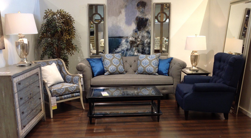
Accessories. Accents are a great way to add colour because the investment and commitment are small. Consider bed coverings, cushions, rugs, table linens, dishes, vases and artwork, just to name a few. Bright pillows can look stunning on a neutral sofa. They can really add some personality.
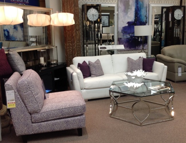
Bold Colours at Stoney Creek Furniture
Statement Pieces. If you really want to make a style statement, go beyond accessories and choose accent furniture pieces with bolder colour. A teal chest is functional, fun and fabulous. Or, how about a chair in rich grey with hints of chartreuse? It’s a more subtle approach, but still adds plenty of impact.
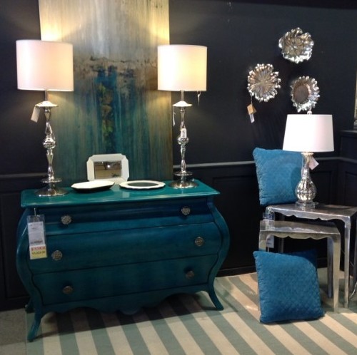
Bold Colours at Stoney Creek Furniture
Paint. A bold colour accent wall is a tried and true way to spice up a room. But what about half walls of bright? Paint the bottom third of the walls bright and leave the top in a light neutral. Don’t add wainscoting on the divide – the modern take is simply colour meeting colour in a straight line.
Geometrics. Splash some bright on your walls (or ceiling!) in geometric patterns. Circles and diamonds are easy to do and look great. How about zigzags? Be creative!
Rustic as a Base. While bright colour accents suit any décor style, there’s something special about the contrast of bold colour against rustic furniture.
Doors and Trim. Here’s a fun way to add colour – consider it for doors or trim. We tend to stick to white or beige, but consider the possibility. Imagine gorgeous coral trim in your front hallway – what a delightful welcome to guests.
Beds. If you’re fortunate enough to have an old brass or cast iron bed, open your mind to painting it a fresh bright colour. Keep your other furniture wood or white, just pop the bed colour.
Legs. If you have older furniture, experiment with painting the legs only a bright colour! Yes! This looks charming on beds, hall tables, etc. Again, less is more; keep it to shorter-legged pieces.
Bright and Soft of the Same Shade. One of the most appealing ways to add bright colour is to mix it with a lighter shade of the same tone – for example, mixing fuchsia with a soft pastel pink. Hint! Paint cards are a great way to explore this – the shades are all laid out for you.
With Black and White. For maximum drama, pair bright colours with black and white. This is a very contemporary style, especially appropriate in a kitchen for a clean, fresh look.
With Grey. They say that grey is the new beige. With that in mind, picture an aqua sectional in a dove grey family room, perhaps with rich navy blue accents. Bright can still be understated!
Leave a Reply