“Mere colour… can speak to the soul in a thousand different ways.” -Oscar Wilde
Can you imagine life without colour? Don’t even try! Colour is a remarkable, joyful part of the human experience. Colour creates moods and can affect actions. No wonder then, that choosing décor colours, whether paint, furnishings or accessories, is such an important decision. With a force this powerful, you can actually shape how you, your family and your guests feel in your home. Colour affects each of us on a personal level, but overall, certain colours elicit specific feelings.
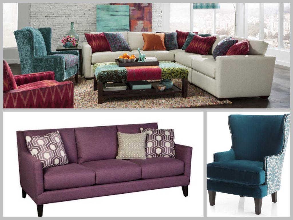
Brandon Collection
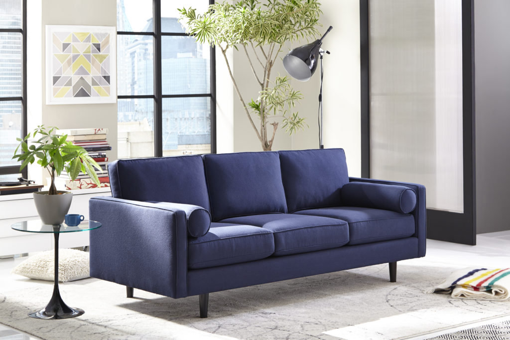
Blue. There’s a reason spas are often painted blue – it’s tranquil and peaceful. Blue has actually been shown to lower blood pressure. Blue is ideal for bedrooms and bathrooms, especially blended with fresh white. Upholstery or accent furnishings are a wonderful way to inject the timeless appeal of blue.
Red stimulates and energizes. Blue is tranquil and peaceful. Green is a connection to nature.
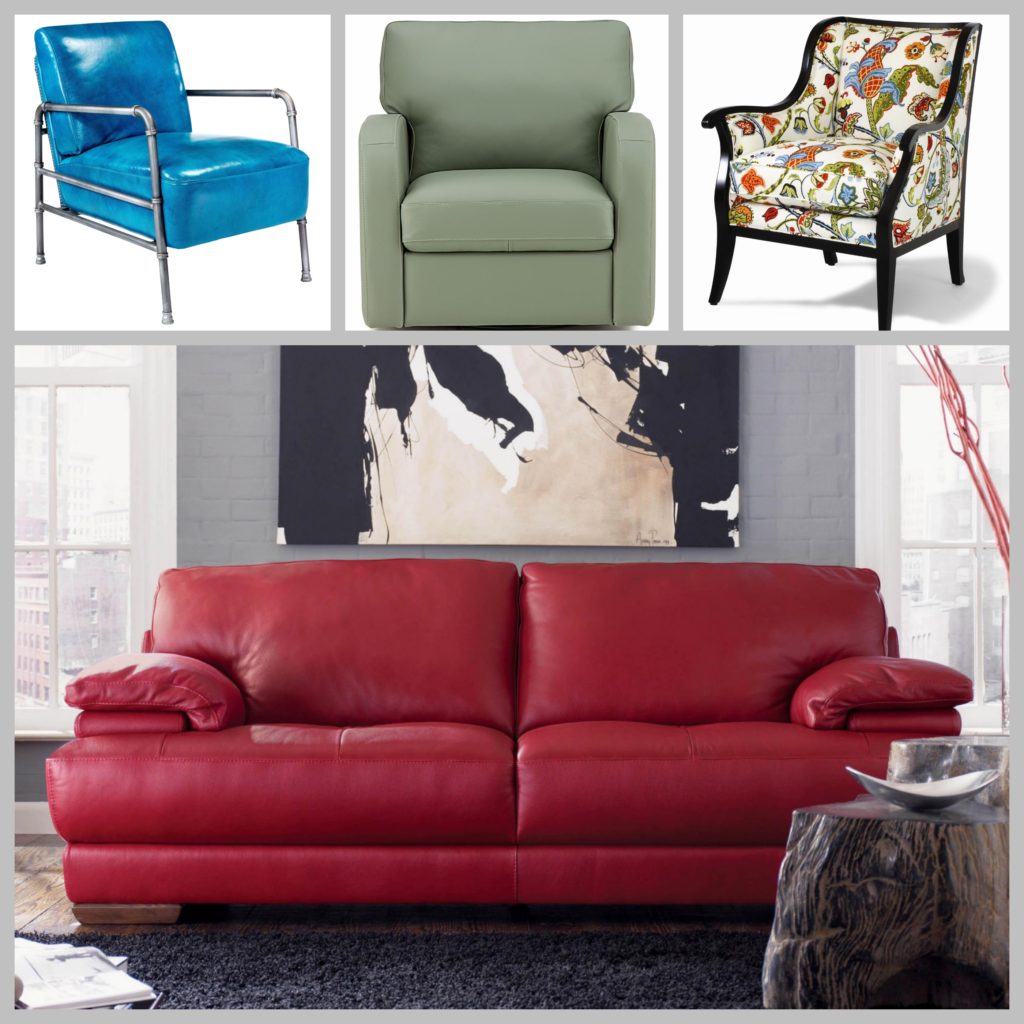
Red. This bold colour stimulates and energizes; it may even increase your heart rate! If you’re adventurous, red may be for you – but too much red overexcites and creates restlessness. A few red accents or a bold red sofa may be all you need. Tip: Red is great in a kitchen as it increases appetite.
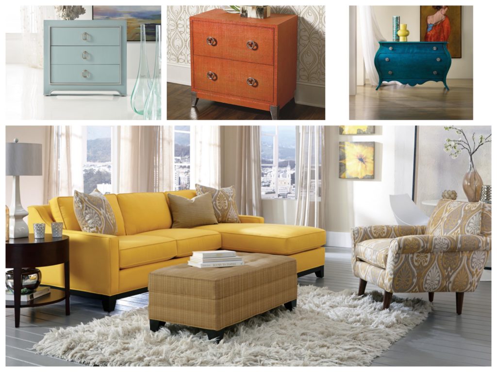
Orange. Red’s calmer cousin is friendly and fun, but never aggressive. Associated with hospitality, orange is great for a dining room or living room. Like just a little orange? Try an orange accent chest, throw cushions or a side chair.
Pink. Yes, pink is feminine and of course, ideal for a girl’s bedroom. It’s also calming and fresh – and when used with neutrals, surprisingly refined. One of my favourite tips is to use pale pink is as a ceiling colour; it’s subtle and elegant.
Yellow signals optimism and positivity. Orange is associated with hospitality.
Yellow. Pale yellow adds a touch of warmth and sunshine, while bright yellow is more stimulating. All hues of yellow signal optimism and positivity. Yellow accessories are a great choice or select yellow for a furniture focal point. A little yellow, especially bright yellow, goes a long way in most spaces.
Green. Like blue, green is a connected to nature. It symbolizes hope and abundance and creates an atmosphere of calmness. It’s perfect for living rooms, bedrooms and offices. There are many shades of green, including vibrant Greenery, Pantone’s 2017 Colour of the Year.
Purple is mysterious, royal and dignified.
Purple. Extremely versatile, purple pairs beautifully with jewel tones, neutrals and pastels. Purple is mysterious, royal and dignified – it can be dramatic or soft depending on the shade.
Black. Black is ideal for accessories and stand-out furniture – it highlights in the most sophisticated way. Although it can be associated with death and mourning, black can also be considered chic and sophisticated.
White. Youth, innocence, freshness – these are the connotations of white. White adds life, openness and airiness to a space. It’s invigorating yet peaceful. Too much white can be chilly, but just by adding other neutrals, the effect is classic and pure.
Brown. Natural and comfortable, brown creates a feeling of security and stability. It’s earthy, a touch rustic and works especially well for wood floorings and wood furnishings. A neutral of sorts, brown blends with most colours, adding depth and warmth.
The best advice I’ve heard about choosing colours is to pick what you love. With that as a foundation, you’ll always feel at home!
Leave a Reply