This year, all colour trends point to fresh! While that may mean a break from beige, it doesn’t mean all neutrals must be abandoned. Enter navy – the ‘new’ neutral that’s giving black a run for its money. While black is timeless and always apropos, here are a few reasons to try navy as a black substitute:
Navy matches everything. Navy is every bit as flexible as black. Whether with grey (this season’s fav neutral), pastels, brights, jewel tones or white, navy works! In fact, many experts would say it looks better than black with colours like pale pink, red or yellow. (Navy actually works well with black too, especially when accented with white.) And if you still love beige and taupe, navy is the perfect way to add a touch of interest. HINT: Pantone’s Colour of the Year, Greenery, sparkles with navy!
Epicenters Gimbel Accent Chair
Navy inspires themes. Navy is preppy and traditional, yet still trendy. Navy and white is the foundation for a fun nautical theme. Navy with turquoise is beautifully beachy. Navy and white stripes are cottagey, warm and welcoming.
Navy is softer and more subtle than black. Black and orange = Halloween. Black and red = harsh. Black and grey = dark. But substitute navy for black and the effect is much more understated. Navy is classic and tailored – a sailor’s jacket, a prep school blazer – it’s always appropriate, always ‘well dressed’.
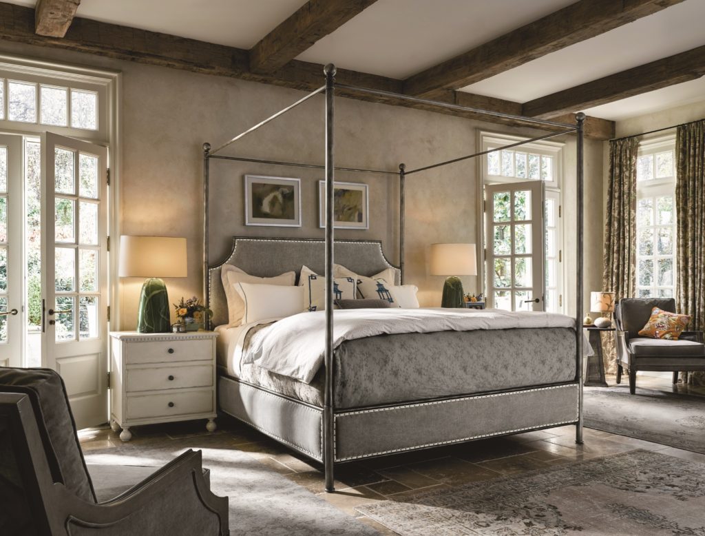
Navy is ‘boy’ or ‘girl’. Wonderfully gender neutral, navy is an ideal choice for a bedroom. It’s never frilly, but never macho either.
Navy looks good with all woods and metals. Dark rich glossy hardwood floors or rugged distressed floors; oak or mahogany furnishings, brass or chrome fixtures – navy complements them all beautifully.
But how and where should you use navy?
Navy furniture. A navy sofa is so much more exciting than black, yet just as versatile. How about a gorgeous navy accent chair? Maybe a metal chair painted navy? Or perhaps a chair with a stunning navy pattern? Whatever your décor style, navy fits. HINT: How about navy kitchen cupboards?
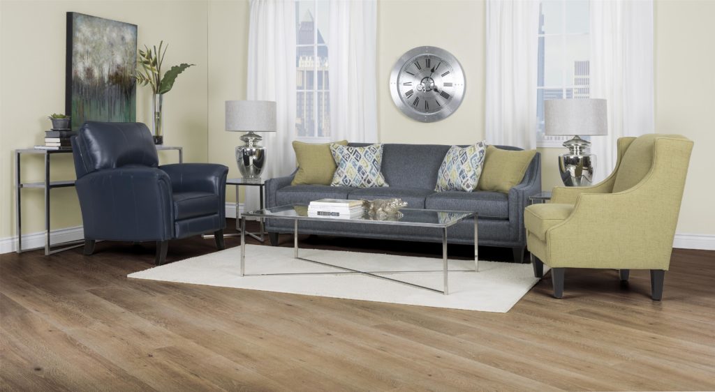
Transitional Attached Back Sofa with Track Arms
Navy walls. Black walls are only for the very adventurous; navy is much less sombre, yet just as impactful. Crisp white trim sets it off. And don’t forget, there’s no reason not to use navy with black. A black leather loveseat in a foyer with navy walls is dramatic.
Navy accents. Navy striped pillows or throw rugs, a navy mohair throw, navy and white graphic wallpaper, navy velvet drapes – touches of navy instantly add traditional beauty to any space.
Navy has a luxe quality about it, yet it’s never pretentious. Move over black. Navy has arrived!