As 2017 winds down, many paint companies have already revealed what colours will be on trend for 2018! Whether you’re looking to repaint one room or many, purchase new furnishings or just add new accessories – here are the very latest colour picks from the experts.

Benjamin Moore Caliente AF-290
From Benjamin Moore: Caliente. ‘A strong, energetic red with personality to spare’, Caliente adds warmth and excitement to any space. It’s a ‘jolt of drama’ for a classic farmhouse; it adds ‘playfulness’ in a modern setting and it ‘revs up warm weathered woods, ocean grays and greens’. If you want unbridled drama, Caliente is your colour!
Behr In the Moment
From Behr: In the Moment. Behr’s very first colour of the year ‘speaks to our society’s desire to disconnect and be present’ according to Behr. Subdued yet striking, it ‘creates harmony for interiors or exteriors’. In the Moment combines spruce blue, soft gray and lush green for a feeling of sanctuary and relaxation.

Glidden Deep Onyx
From Glidden: Deep Onyx. Deep Onyx embraces a ‘less is more, back to basics’ approach. Declaring black as the forgotten neutral, Glidden recommends Deep Onyx for an accent wall or instead of white on trim. It’s simple and no-fuss, ideal for minimalist settings, but paired with more vibrant shades, ideal in a traditional space too.

Olympic Black Magic
From Olympic: Black Magic. The experts say this shade addresses our need for ‘deep, comforting colours that offer a welcomed escape from the chaos of daily life’. Black Magic is a bold statement but don’t be intimidated – it’s also soothing and simply gorgeous with light furniture and accessories.
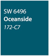
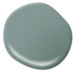
Sherwin-Williams Oceanside
From Sherwin-Williams: Oceanside. Sherwin-Williams calls this deep-sea blue ‘opulent and mysterious’. We agree! It brings to mind beach vacations and the richness of the Mediterranean. Oceanside pairs well with neutrals or opposites like bright pink. Choose it for an unexpected space like a living room.
What do they have in common?
- Deeper shades for intimacy. 2018’s rich colours are perfect for creating a space that’s private, cozy and insulated from the world outside.
- Modern yet still classic. These timeless colours look great in contemporary, traditional or transitional settings and will look stylish way beyond 2018.
- Many act as neutrals. While much edgier than taupe or grey, many of the new colour trends are decidedly neutral – and that means easy integration with the décor you have now and as you continue to update your home’s look.
- Adventure in the air. Some have described 2018 colours as ‘risky’. While that’s probably an overstatement, they are definitely intense! If you’re shy about taking a big leap, remember that accessories, accent walls or half walls are great ways to sample a shade.
Stay tuned! Pantone, the world’s leading authority on colour, will be announcing its 2018 Colour of the Year shortly.
Leave a Reply