 No matter how cold and snowy it is outside, your home can be a wonderful escape from the dreary days of winter. We’re just into 2014 and already I’m anxious to start home decor changes for the New Year. Winter is a great time to renovate, buy new furniture or update the look of your space. With fewer temptations to go outside and play, you’ll have plenty of time to focus on your plans!
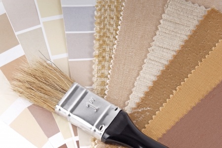
We recently introduced you to the Radiant Orchid – the Pantone Color of the Year. If you haven’t incorporated it into your home already, it’s a fantastic starting point for your decor projects. So what’s the buzz in home colours for 2014? Read on …
Pastels
While bright and bold colours still have their place, pastels are making a comeback. Not the sweet candy colours of decades gone by, but classy pastels with a neutral undertone. Think of it like gray or beige with a wash of pink, lavender, blue or green. These soft shades flatter a home, giving it warmth and charm; they are the perfect back-drop to showcase your art, furnishings and accessories. For the more adventurous, go with a lovely lavender for your living room. For the more conservative, try a soft green in your powder room.
Neutrals
The pastels above are so gentle; you can almost consider them the new neutrals. But for those who yearn for the tried and true, browns, taupes and grays are still beautiful choices. To keep them current, add a dash of colour – we call them tinted neutrals – just a smidge of blue, green, pink or purple in the mix makes all the difference.
Washed Palettes
Another trend to watch for is a gentle wash on colours – almost as though they’ve bathed in sunlight. The effect is “dusty” – very soft, gentle and kind to our eyes. As we struggle to bring harmony to our lives, these filtered shades soothe the senses and take the edge off all the technology in our homes.
Natural vs. Artificial: Green and Blue
With environmental issues still at the forefront, green continues to be a major force in home decor. This season’s greens lean toward natural and away from neon – more sophisticated greens are on trend. Limes and sun kissed yellows look wonderful, as well as olive and army greens. Many blues are muted this season – again, softness reigns. You’ll also see rich blues, however, like navy and dark royal blue. Some are calling navy the new black! It’s a gorgeous colour and works perfectly with soft pastels.
Brights
If you love bold colour, true reds like crimson and tomato shades are still hot! But with many of us embracing the gentler look, they may be best as accent colours – a single wall, a side chair or two or a pair of velvet cushions. Purple is still on trend as well, but lean toward Radiant Orchid – the key words are soft, subtle and sophisticated.
With reference to Benjamin Moore, “Colour Trends 2014”. ©Benjamin Moore and Company. All rights reserved.
Leave a Reply