Pantone, the world’s leading experts for all colour-related matters, has announced the Colour of the Year for 2016 – and for the first time, it’s a two shades! Warm, nurturing Rose Quartz is brought together with cool, tranquil Serenity, combining soft pink and blue beautifully while challenging our traditional perceptions of colour perception. It’s about embracing connection, commonality and our yearning for harmony.
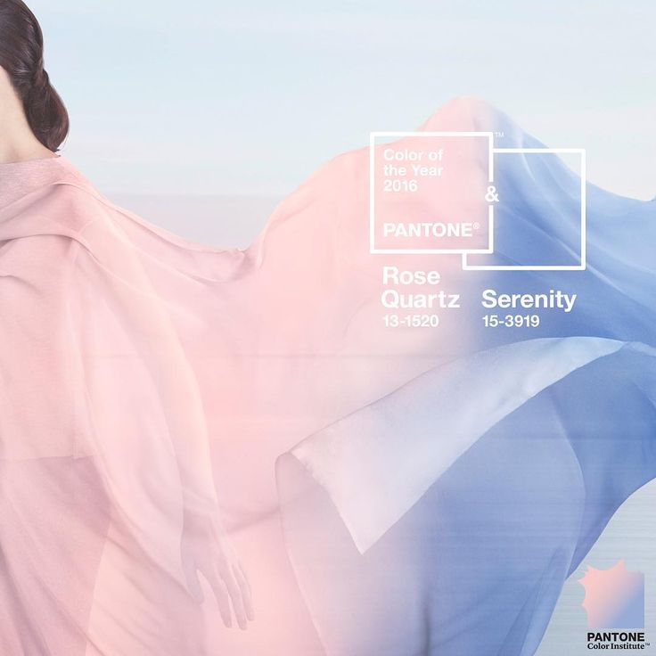
Photo Courtesy of the Pantone Color Institute
As Pantone states, “In many parts of the world we are experiencing a gender blur as it relates to fashion, which has in turn impacted colour trends throughout all other areas of design. This more unilateral approach to colour is coinciding with societal movements toward gender equality and fluidity, the consumer’s increased comfort with using color as a form of expression, a generation that has less concern about being typecast or judged and an open exchange of digital information that has opened our eyes to different approaches to color usage.”
Rose Quartz and Serenity blend like the shades of a perfect sunset, reassuring us of another day’s opportunity and reflecting the beauty of simply ‘being’ in a world fraught with upheaval. Rose Quartz is compassionate and caring while Serenity reflects order and peace. Together they speak to our craving for stability, balance and understanding.
Rose Quartz and Serenity Colour Combinations
This calming, relaxing combo works easily with other mid-tones including greens and purples and all shades of yellow and pink. Ground the colours with a neutral rich brown or join them with silver or hot brights for more impact. For more info on colour pairings, visit www.pantone.com.
Rose Quartz and Serenity in Your Home
The feeling of Rose Quartz and Serenity is decidedly subtle. If your home is light and airy, it’s a natural fit; if your look is more dark and rich, combine the colours with some of the more dramatic shade suggestions above. Here are a few ways to welcome the combo into to your home:
Impressionism. Rose Quartz and Serenity have watercolour softness and set the stage for wall hangings and fabric/upholstery with impressionist styling and gentle pastel blends, an ethereal sort of beauty. Choose linens, draperies, chair slip covers or large wall canvasses with a watercolour effect, focused on pinks and blues.
Stack the colours. Alternate Rose Quartz and Serenity in any number of accessories – cushions, flower pots, plates, towels, etc. Very fresh and fun.
Accent pieces. As the colours become entrenched in the marketplace, you’ll see more and more in furnishings. If you love the combination, invest in an accent chair, ottoman or loveseat in the combination.
Look to nature. A wonderful way to bring Rose Quartz and Serenity into your home is to find inspiration in nature. Photos abound of pink and blue sunsets, pink flowers against a blue sky, pink toned sand awash in a blue ocean – and much more.
Just a touch. If you’re shy to embrace the look wholeheartedly, a touch is all it takes to be on trend – a bed throw, a bench recovered, pink and blue candles or table placemats, for example.
Unexpected places. Just as this combination challenges our perceptions, opt to use it where it’s least expected. Consider gorgeous translucent sheers in both colours, layered on your windows. Reupholster your worn dining room chairs in Serenity, reserving Rose Quartz for the ‘head’ and ‘foot’ chairs. Welcome your guests with soft wide stripes of painted Rose Quartz and Serenity on your foyer walls. Use your imagination!
This is an interesting pairing for Pantone Colour of the Year. It’s soft and gentle, yet together makes a strong statement about our cultural shift toward gender equality.
Leave a Reply