At long last, traditional neutrals are stepping back as colour comes forward in our homes – in rich jewel tones, warm shades like terra cotta and colours that act as neutrals (like sage and navy). With this joyous refocus on colour also comes a renewed interest in patterns and prints.
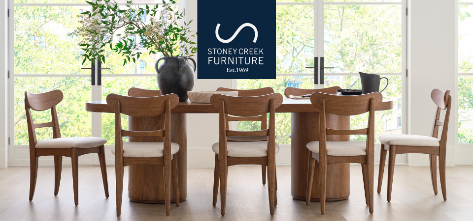
Barten Collection coming soon!
What are the latest trends in patterns? How can you integrate them into your home? Read on!
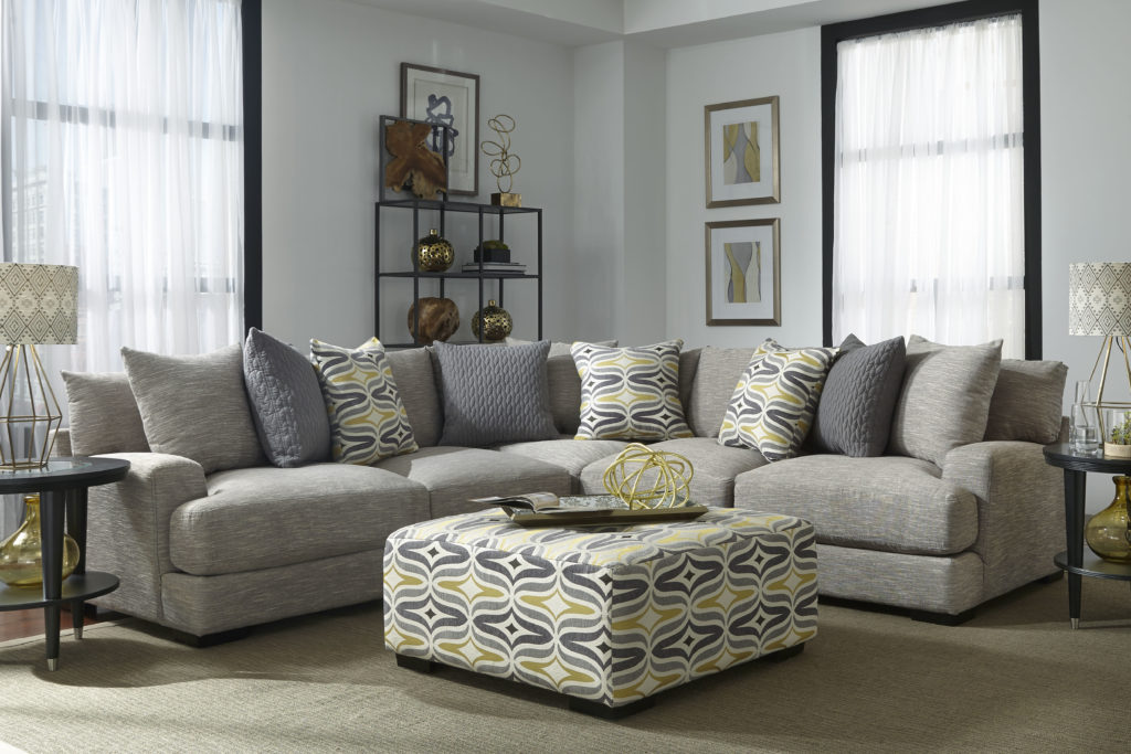
Geometrics. 2018 makes a nod to retro 1960’s and 1970’s décor with a wide range of geometrics on furnishings, accessories, walls and even ceilings! Classic stripes are abundant, as well as triangles, chevrons and the most trendy of all, the beloved circle.
Greenery. A love affair with house plants and all things green continues in 2018, including on our upholstery. Large scale tropical leaves are the most on trend, featuring palm fronds and willowy stems.
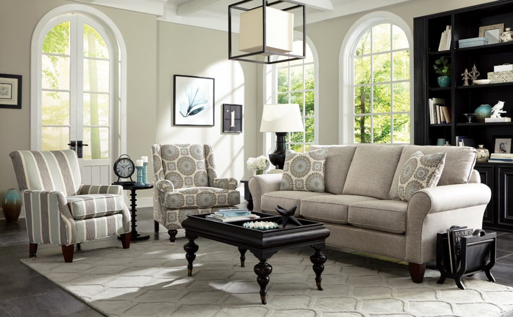
Florals. Timeless and traditional, floral prints are always beautiful. This season, they’re big, bright and fun. Look for contrasting colours in floral draperies, cushions and furnishings.
Quatrefoil. Did you know that quatrefoil means ‘four leaves’, from the Latin quattuor? Originally referring to clover patterns, quatrefoils have come to refer to any variation of four-leafed pattern. This season they’re adorning upholstery, accessories, rugs, tiles and beyond – a beautiful mix of trend and tradition.
Ikat. If you love vibrant colour and a Bohemian sensibility, Ikat fabrics are for you. Ikat is a traditional textile dyeing technique, popular in Asia and South America. Ikat fabrics are typically bright and multi-coloured with gorgeous intricate patterns.
Texture. Combined with abundant patterns this season, you’ll also see lots of texture in fabrics. Luxe velvets, yarns, nubby wool, linen (imperfect wrinkles are also on trend!) and of course, cotton.
Townhouse Collection
How do you bring it all together? Here are a few rules to guide you:
- Always anchor vivid patterns with neutrals and plains. The eye must rest; too many patterns are confusing and chaotic.
- Use juxtaposition for maximum impact – for example, florals set against the ruggedness of urban industrial or farmhouse décor.
- A pattern in isolation looks random. Repeat one or two patterns in several elements – for example circle upholstery on sofa throw cushions can be echoed on sheer draperies with subtle circles and a circle-shaped ottoman.
- Keep intensity consistent. Don’t display pastels against bright patterns. Instead try solids in the same palette.
Enjoy adding patterns and prints to your home this season! They will add incredible ambience.
Leave a Reply